Island Health Website
Island Health Website

Role
Product Designer
Duration
September 2021 - December 2021
Problem
Island Health's navigation and information architecture was difficult to follow causing users to be deterred when trying to find information.
Pages usually led the user to a phone number, which increased daily phone calls to be more than what their office could handle. Patients who were unable to physically visit the hospital to schedule an appointment experienced high wait times to talk to Island Health's office.
Pages ended in a phone number, not a solution.
Pages ended in a phone number, not a solution.
When users want to complete a task on Island Health's website, a phone number is a poor solution.
When users want to complete a task on Island Health's website, a phone number is a poor solution.
Goals & Alignment
While auditing Island Health's site, we aligned with the marketing team on their goals. The top priority was improving navigation, as the site contains a lot of poorly organized information. Our goal was to map the information architecture and conduct user research to reorganize navigation effectively. The second priority was reducing calls to the office by improving the accessibility of information on the site, particularly for pages ending with a phone number as the CTA.
While auditing Island Health's site, we aligned with the marketing team on their goals. The top priority was improving navigation, as the site contains a lot of poorly organized information. Our goal was to map the information architecture and conduct user research to reorganize navigation effectively. The second priority was reducing calls to the office by improving the accessibility of information on the site, particularly for pages ending with a phone number as the CTA.


User Survey
We created two surveys for internal and external users. Starting with umbrella questions and HMWs, we brainstormed what questions to ask our users. After gathering data, we organized the significant findings and opportunities.
We created two surveys for internal and external users. Starting with umbrella questions and HMWs, we brainstormed what questions to ask our users. After gathering data, we organized the significant findings and opportunities.

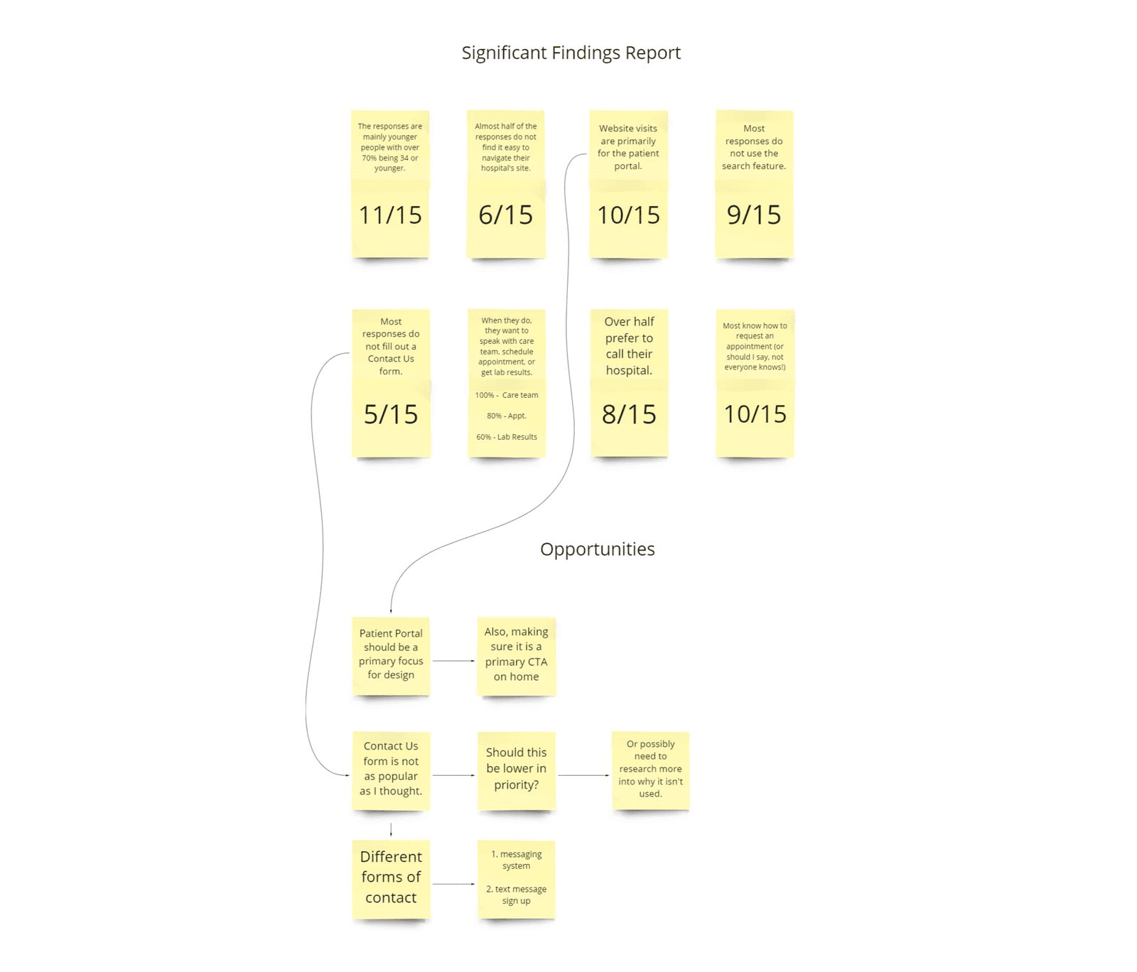
User Interviews
Conducting user interviews led to crucial findings regarding what information patients call about and their current pain points.
Conducting user interviews led to crucial findings regarding what information patients call about and their current pain points.

Information Architecture
After completing an audit of their entire site, I mapped out their current site and started brainstorming better ways to organize their information. This was quite a challenge with so many pages within the navigation.
After completing an audit of their entire site, I mapped out their current site and started brainstorming better ways to organize their information. This was quite a challenge with so many pages within the navigation.

Wireframes
During the wireframing stages, we designed multiple iterations starting from sketches through high-fidelity wireframes. I focused heavily on navigation to make sure important information was easy to find for users.
During the wireframing stages, we designed multiple iterations starting from sketches through high-fidelity wireframes. I focused heavily on navigation to make sure important information was easy to find for users.


Final Navigation
After approval from the client, we nailed down the final design for the navigation! Focusing on clarity for the user led to structuring the navigation into categories that were from their perspective.
After approval from the client, we nailed down the final design for the navigation! Focusing on clarity for the user led to structuring the navigation into categories that were from their perspective.
Usability Testing
Before launch, we meticulously tested the site updating any content that the client wanted changed, tested responsiveness, accessibility, links, etc.
Before launch, we meticulously tested the site updating any content that the client wanted changed, tested responsiveness, accessibility, links, etc.
