Tesla Dashboard UI
Tesla Dashboard UI


Role
Product Designer
Duration
March 2020 - May 2020
Problem
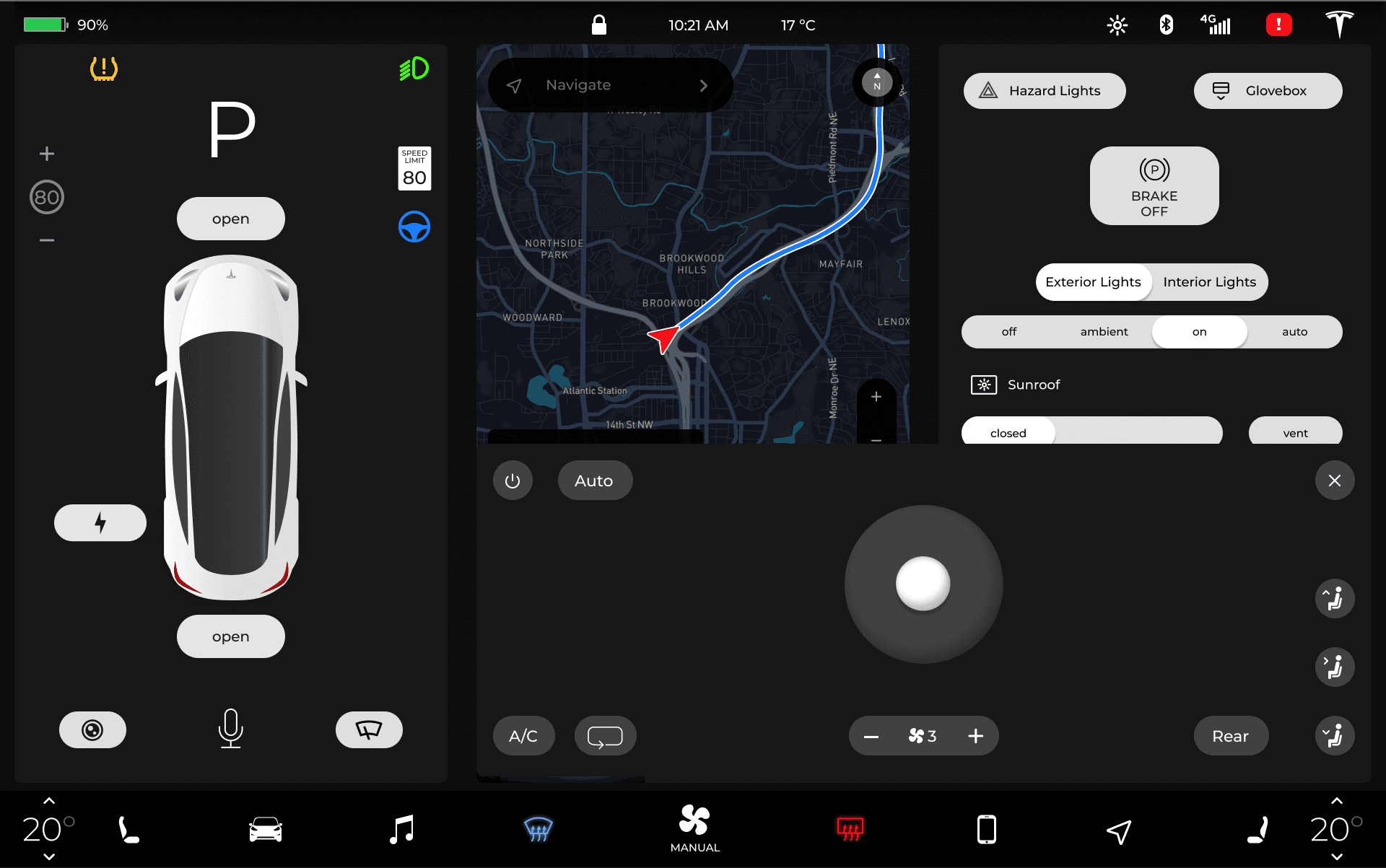
The Tesla Model 3 is intentionally designed without the driver in mind. With the introduction of the Full Self Driving (FSD) feature, Tesla designed their UI to highlight its autonomous driving capabilities. Everything is placed into separate screens distracting drivers by making them dig for controls on the road.
One screen, many problems
One screen, many problems
Imagine having to tap multiple times just to turn on your wipers…
Imagine having to tap multiple times just to turn on your wipers…
Research
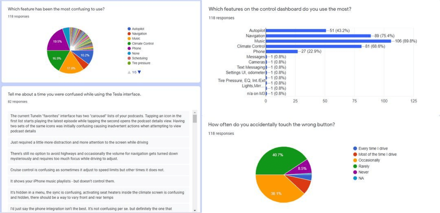
I began my research understanding the pain points of my users through a survey yielding over 100 responses from Tesla owners. Significant findings include too many interactions to access controls, swiping interactions not working properly while driving, difficulties finding specific music, and climate control taking up screen space.
I began my research understanding the pain points of my users through a survey yielding over 100 responses from Tesla owners. Significant findings include too many interactions to access controls, swiping interactions not working properly while driving, difficulties finding specific music, and climate control taking up screen space.

Results
Following the user survey, I found the features causing the most problems were Music and Climate Control.
Following the user survey, I found the features causing the most problems were Music and Climate Control.
56% of drivers mentioned difficulty playing albums or songs.
Primarily, the sliding interactions caused the most issues.
Primarily, the sliding interactions caused the most issues.
40% of drivers said Climate Controls blocks important features.
As an overlay feature, the Climate Controls took up half of the screen. Also, attempting to close occasionally adjusted the vent position instead.
As an overlay feature, the Climate Controls took up half of the screen. Also, attempting to close occasionally adjusted the vent position instead.
Wireframes & Iterations
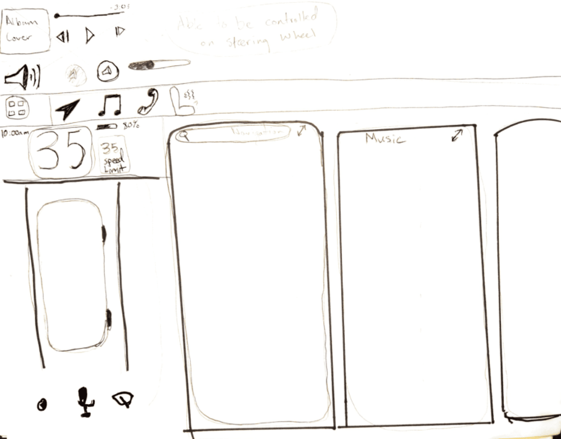
I started my wireframes by sketching out different screen layouts. Since I was designing for a unique interface, I wanted to spend ample time discovering solutions in this phase.
I started my wireframes by sketching out different screen layouts. Since I was designing for a unique interface, I wanted to spend ample time discovering solutions in this phase.

A/B Testing
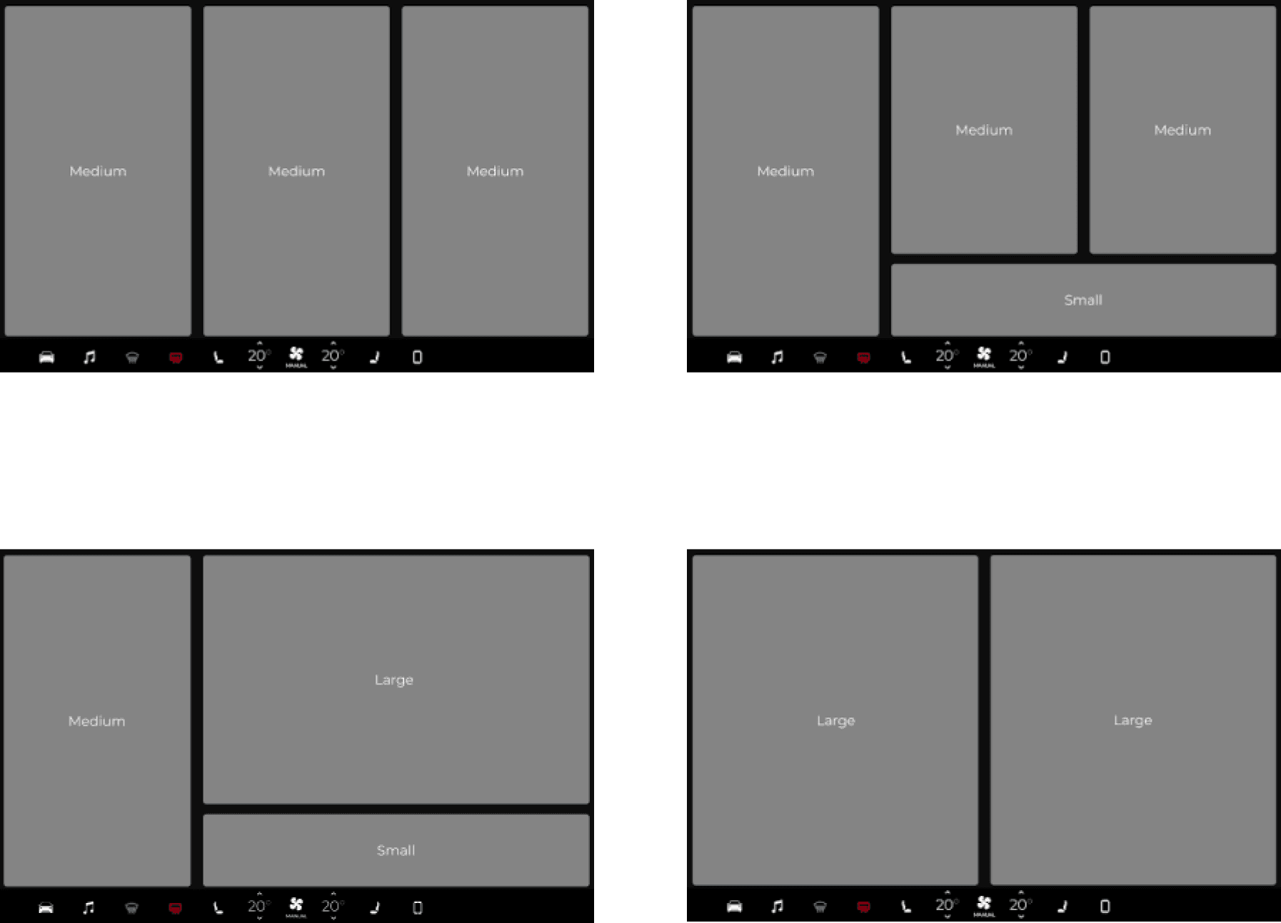
With multiple layout ideas, I did A/B testing to understand what works best for users.
With multiple layout ideas, I did A/B testing to understand what works best for users.

Layout Decision
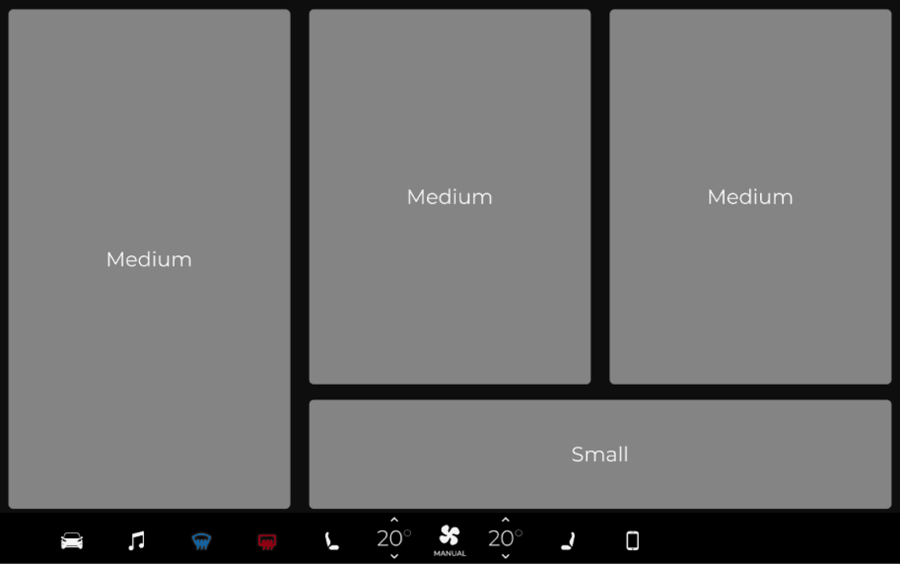
I quickly tested these variations on users to determine which was the easiest for them to use. The results indicated this layout was the best for flexibility and size diversity.
I quickly tested these variations on users to determine which was the easiest for them to use. The results indicated this layout was the best for flexibility and size diversity.

High Fidelity Wireframes
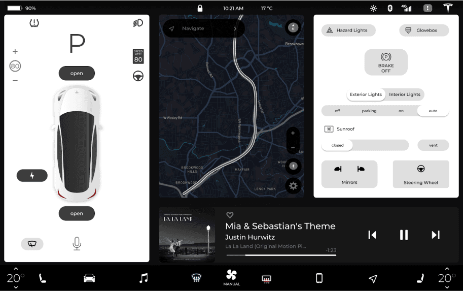
I then moved onto high fidelity wireframes focusing on the location of primary signifiers.
I then moved onto high fidelity wireframes focusing on the location of primary signifiers.

Final Design
Final Design
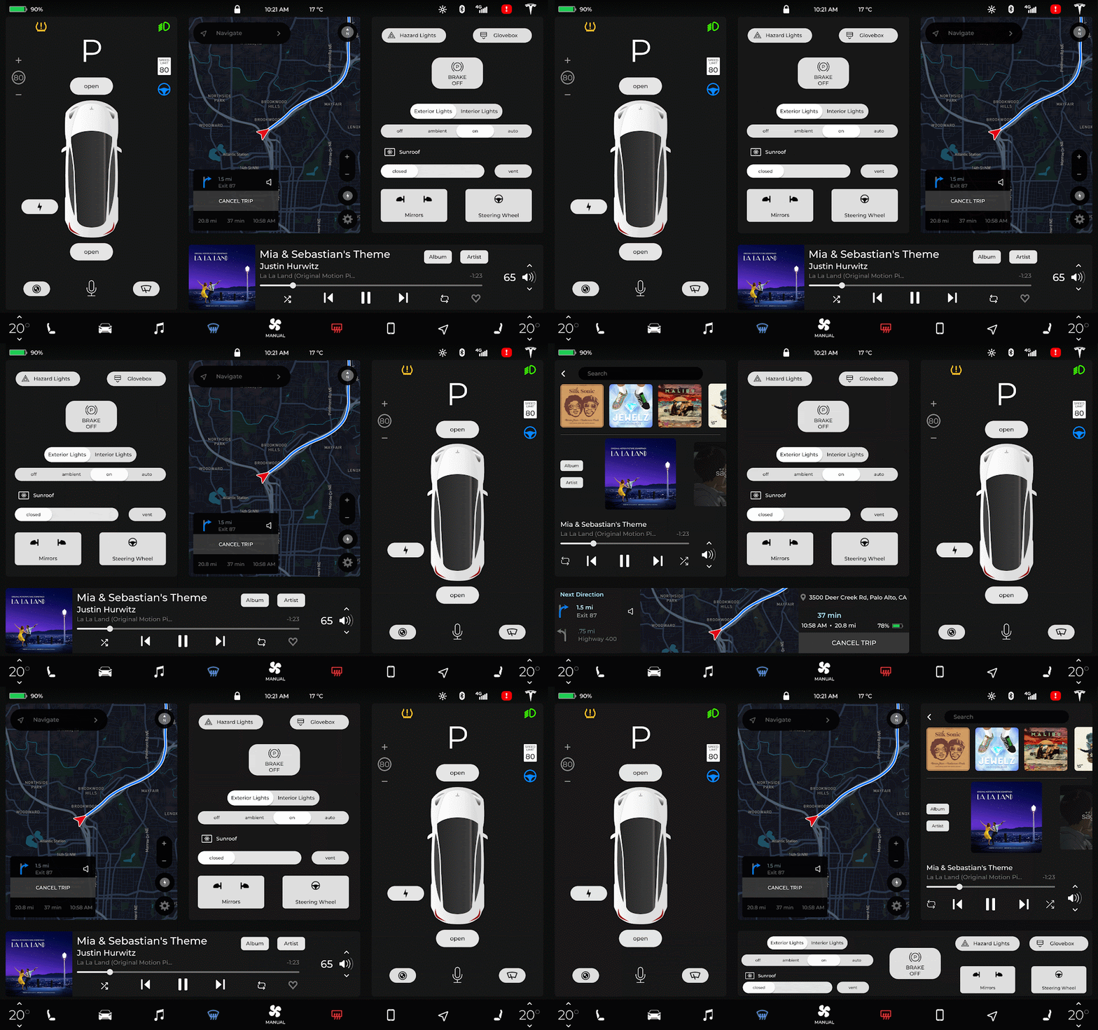
From user survey results, I designed a customizable screen layout with quick controls for high-priority settings to decrease distractive screen interactions.
From user survey results, I designed a customizable screen layout with quick controls for high-priority settings to decrease distractive screen interactions.

Climate Control Overlay
Climate Control Overlay
To resolve the climate controls taking too much of the screen, it now appears in a smaller area allowing for a majority of the screen to still be accessible.
To resolve the climate controls taking too much of the screen, it now appears in a smaller area allowing for a majority of the screen to still be accessible.
